Dave Roth remembers...
"In the early '80s, when I was at the beginning of my career in the sign industry, a very successful, old-school sign company owner sat me down and explained that 3M did a survey back in the 1960s that demonstrated that our minds recognize three things about a sign when we're driving down the road, and that all successful signs have these three elements: shape, color, and copy. If you look around, you'll see that's as true today as it was back then."
Shape. The first thing your mind recognizes is the shape of the sign. A typical sign is either square or rectangular. While a square or rectangular sign is certainly traditional, you might want to be open to other shapes if you want to create a truly memorable sign.
Color. The second thing you see about a sign is its colors. Bright colors and/or good contrast are always eye-catching.
Copy. Last but not least is what the sign says, which is the "copy." An brief, easy-to-grasp message written in a clean, easy-to-read font will stand out from the clutter.
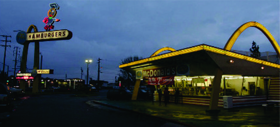
A perfect example of the use of the Shape-Color-Copy design principle is McDonald's. The picture above is from http://en.wikipedia.org/wiki/History_of_McDonald's. This illustrates that back in 1959 (a great year by the way) McDonald's had already figured this out. It also hearkens back to the days of the postwar era when the roadside was filled with larger-than-life advertisements of all shapes and colors vying for motorists' attention: "Hey, pull in over here! This is Your Kind of Place!" Designed by architect Stanley Clarke Meston and his assistant Charles Fish, Downey's restaurant is the oldest operating McDonald's in the world.
Today, McDonald’s still employs the same three design principles. The golden arches (shape), red and yellow (color) and then the name (copy) McDonald’s. Many locations don't even need the name itself anymore; the shape and color suffice.
Try this experiment yourself. Drive with friends and family down the road. Ask them to look at the signs and point out the ones that grab their attention first.
To be successful in today’s economy, you need to set your business apart from your competition. It's likely that you are creating brand recognition in various ways, which can include advertising on the radio, on television, in print media, and on the internet. A well-designed sign will work for you as well, to reinforce your marketing efforts—to reinforce your brand.
Does your current sign complement those other forms of advertising and bring customers in your door? In other words: Is your current sign pulling its own weight?
Please feel free to contact me for a free consultation.
Thank you, and I hope to hear from you soon,
Dave Roth
Rothco Signs & Design, Inc.
David T. Roth, owner
Office: 941-423-5966 Cell: 941-706-6160
email: Dave@RothcoSigns.com
"In the early '80s, when I was at the beginning of my career in the sign industry, a very successful, old-school sign company owner sat me down and explained that 3M did a survey back in the 1960s that demonstrated that our minds recognize three things about a sign when we're driving down the road, and that all successful signs have these three elements: shape, color, and copy. If you look around, you'll see that's as true today as it was back then."
Shape. The first thing your mind recognizes is the shape of the sign. A typical sign is either square or rectangular. While a square or rectangular sign is certainly traditional, you might want to be open to other shapes if you want to create a truly memorable sign.
Color. The second thing you see about a sign is its colors. Bright colors and/or good contrast are always eye-catching.
Copy. Last but not least is what the sign says, which is the "copy." An brief, easy-to-grasp message written in a clean, easy-to-read font will stand out from the clutter.
A perfect example of the use of the Shape-Color-Copy design principle is McDonald's. The picture above is from http://en.wikipedia.org/wiki/History_of_McDonald's. This illustrates that back in 1959 (a great year by the way) McDonald's had already figured this out. It also hearkens back to the days of the postwar era when the roadside was filled with larger-than-life advertisements of all shapes and colors vying for motorists' attention: "Hey, pull in over here! This is Your Kind of Place!" Designed by architect Stanley Clarke Meston and his assistant Charles Fish, Downey's restaurant is the oldest operating McDonald's in the world.
Today, McDonald’s still employs the same three design principles. The golden arches (shape), red and yellow (color) and then the name (copy) McDonald’s. Many locations don't even need the name itself anymore; the shape and color suffice.
Try this experiment yourself. Drive with friends and family down the road. Ask them to look at the signs and point out the ones that grab their attention first.
To be successful in today’s economy, you need to set your business apart from your competition. It's likely that you are creating brand recognition in various ways, which can include advertising on the radio, on television, in print media, and on the internet. A well-designed sign will work for you as well, to reinforce your marketing efforts—to reinforce your brand.
Does your current sign complement those other forms of advertising and bring customers in your door? In other words: Is your current sign pulling its own weight?
Please feel free to contact me for a free consultation.
Thank you, and I hope to hear from you soon,
Dave Roth
Rothco Signs & Design, Inc.
David T. Roth, owner
Office: 941-423-5966 Cell: 941-706-6160
email: Dave@RothcoSigns.com

...a Rothco sign is a sign of success!